
Building Responsive Interfaces with Tailwind CSS
See how I use Tailwind CSS to create clean, responsive, reusable, and modern user interfaces that work smoothly across different screen sizes.
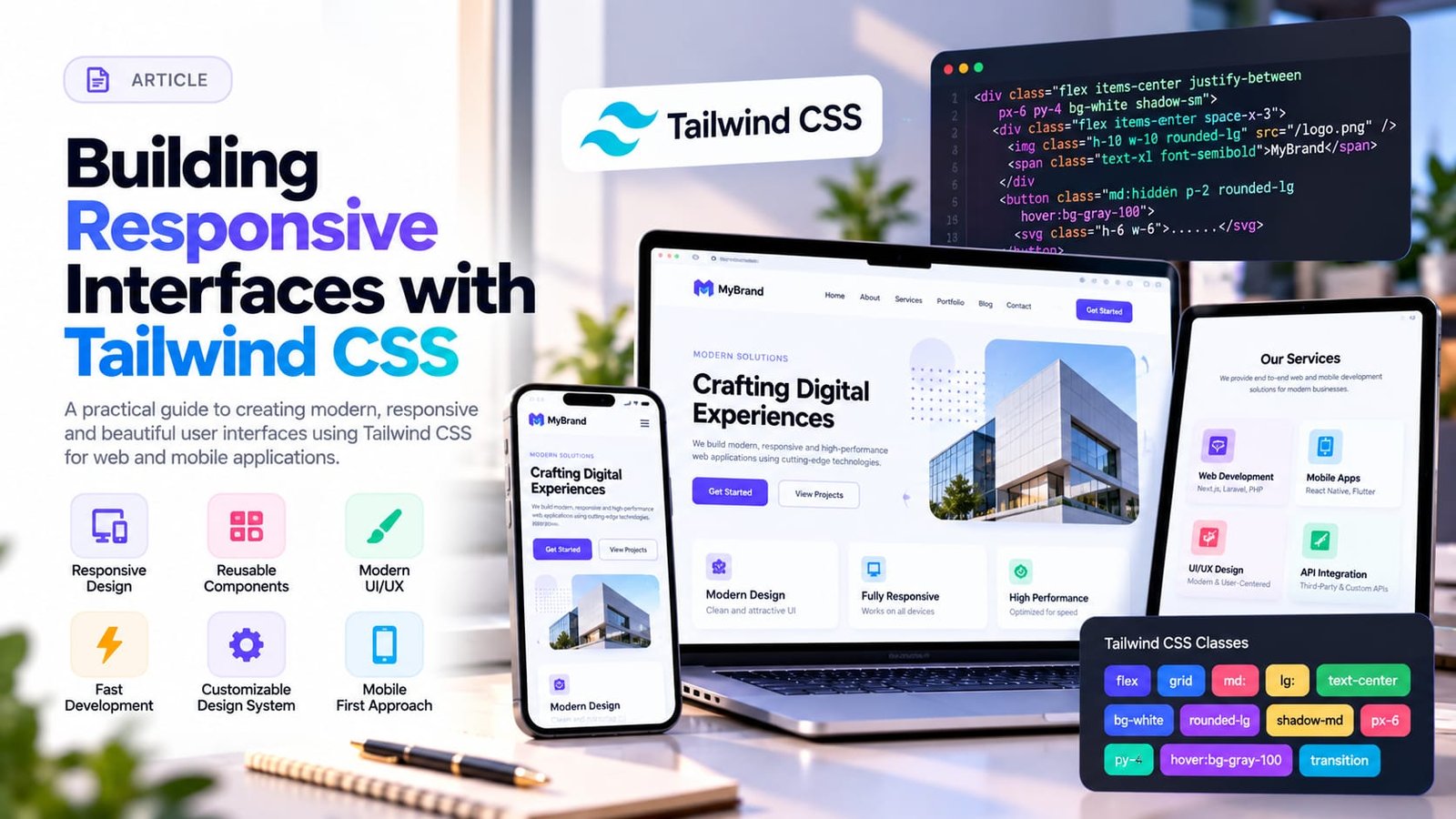
Responsive design is no longer optional. Users access websites from mobile phones, tablets, laptops, and large desktop displays, so interfaces need to adapt correctly across all of them.
Tailwind CSS provides a utility-first approach that makes responsive development faster and more consistent.
Instead of writing a large amount of custom CSS for every component, Tailwind provides reusable utility classes for spacing, typography, layouts, colors, borders, and responsive behavior.
When creating a responsive interface, I normally start with the mobile layout first.
This helps ensure that the most important content and actions work properly on smaller screens before extending the interface for tablets and desktops.
Tailwind's responsive breakpoints make it easy to adjust grid columns, spacing, text sizes, visibility, alignment, and component layouts.
For example, a product grid can display one or two products on mobile while automatically changing to four or five columns on larger screens.
Flexbox and CSS Grid utilities are particularly useful for building dashboards, cards, navigation menus, pricing sections, product layouts, and forms.
I also try to maintain consistent spacing throughout the design. Reusing the same spacing scale makes interfaces feel more polished and professional.
Another advantage of Tailwind is component reuse.
Common UI patterns such as buttons, cards, inputs, badges, modals, and navigation elements can be converted into reusable React, Next.js, Blade, or Vue components.
Responsive design also requires testing actual content rather than only testing empty layouts.
Long titles, dynamic images, validation messages, large tables, and user-generated content can expose layout problems that are not visible during initial development.
Tailwind CSS allows me to create modern interfaces efficiently while still maintaining full control over responsiveness and design consistency.

Musab Afzal
Full Stack Web Developer
Full Stack Web Developer with 2+ years of experience building and maintaining web applications using Laravel, Core PHP, and modern front-end frameworks. Skilled in WordPress theme development, responsive UI design with Tailwind CSS and Bootstrap, and building REST APIs. Currently expanding into Next.js, React.js, and React Native for cross-platform development.
Enjoyed this technical breakdown?
Hire me to engineer similar architectures for your product or check out our client packages.